PROJECT OVERVIEW
PROBLEM STATEMENT
Moveit is an application designed to help people move their residence to a new one to facilitate a smooth transition. The application allows for generating and comparing quotations of the best professional based on the price reviews and choosing the one that best suits your needs.
MY ROLE
User Research | Data Synthesis | UI Design | Prototyping | Usability Testing
PROJECT TYPE AND TIMELINE
User Research and Interface Design- Remote
Length: 10 Weeks
PROJECT SCOPE
Constrains about covid lockdowns and limited timeframe to complete the different tasks restricted me from conducting in-person user interviews resulting in narrow demography.
TOOLS USED


METHODOLOGY

RESEARCH
SECONDARY RESEARCH
HOW DID I CHOOSE THE PROBLEM SPACE?
Moving has been a personal struggle for me, and I always thought of how this process can be more manageable. As a coincidence, I was shifting to a new home while working on this project, giving me more insights into the problem space.
WHAT METHODS DID I USE?
I started my ✏️ desk research by searching for data that would suggest me a path that moving was indeed a problem faced by people in North America. In addition, I was interested in learning more about the problems associated with changing residences and estimating the number of people that do so.

INSIGHTS
5,238,000
In the last five years, individuals have moved within Canada
29.8 Million
People who reported living at a different residence one year ago in the USA.
45%
Respondents said moving is by far the most stressful event in life
PRIMARY RESEARCH
WHO DID I INTERVIEW?
To facilitate the user interviews, I reached out to five individuals who lived in North America and had moved to a new residence at least once in the last five years. I conducted interviews in a decontextualized format to get insights into their pain points, motivations, and behaviour.
WHAT DID I LEARN FROM INTERVIEWS?
Research proved my hypothesis and assumptions correct, and 4 out of 5 interviewees mentioned that moving was indeed the most stressful event in their lives. However, one fascinating insight that I noticed was that people who did not use professional services for moving assumed that the services were very costly.

DEFINE
DATA SYNTHESIS
HOW DID I ANALYZE THE DATA?
After conducting the interviews, I segregated the data into pain points, motivations and behaviours. Once I had this data, I used affinity mapping to group together similar sets of user insights. I then named each theme based on the data represented in the collection.

EXTRACTED THEMES
TIME MANAGEMENT
TIME MANAGEMENT
People staying in North America feel that they can utilize time involved in moving activities such as viewing and packing to do something productive.

COMMUNICATION
People in North America want a effective communication system to ensure prompt responses and no uncertainties.

COST
People in North America are rather selective when selecting moving services and never meet their shifting budgets.

LOGISTICS
People in North America want the entire relocation process to be organized so there are fewer difficulties.

PERSONA
WHO AM I DESIGNING FOR?
I built a persona that would reflect all the insights and summarize the data found during the research. The data collected indicated the users' behaviours, motivations, and pain points. The persona would help identify users need and what they are expecting as a solution to overcome it.

JOURNEY MAP
STEPPING INTO SAMEER'S LIFE
Using the insights and thoughts from the interviews, I mapped out the journey. I divided it into three phases and identified areas where a digital solution could change the possible outcome and experience by mapping out the feelings.

HOW MIGHT WE?
How might we guide people relocating to a new home to find companies and resources needed to facilitate a smooth, timely transition?

IDEATE
USER STORIES AND EPICS
THINKING ABOUT POTENTIAL SOLUTIONS
At this point, I started to think about the solutions which would help Sameer enhance his experience positively. Since the application could have multiple features, I wanted to focus on the persona's needs. User stories helped me tie a connection between users' pain-point/ needs and the app's functionality.

IDENTIFIED EPICS

REVIEWS AND RATING
“As a person who is relocating, I want to see reviews about the moving company so that I can trust the moving company I select.”

ACCESS INFORMATION
“As a person who is relocating, I want to have an easier way to request quotations from companies so that I do not have to keep track of all of them.”
TRACKING
“As a person who is relocating, I want to be informed when the truck will arrive to pick up my luggage so that I can be prepared for it.”
TASK FLOW
HOW DID I INTEGRATE THE NEW FEATURES?
After finalizing the user story epic, I created task and user flow diagrams which helped me visualize how the user would interact with the application. The main task was to allow a user to request and compare quotations based on their requirement.
COMPARE QUOTATION FLOW

LOW FIDELITY WIREFRAMES
PAPER AND DIGITAL SKETCHING
The next step in resolving user issues was to develop screens based on the task flow. I went to existing applications and observed the various design systems they employed. As part of my inspiration session, I made a mood board by collecting screenshots of different app elements.
After that, I created various versions of paper sketches, chose the one I thought would work best for the purpose, and converted them into digital wireframes using Figma.
CRAZY 3'S ❤️


PROTOTYPE
MID-FIDELITY PROTOTYPE
MOVING FROM PAPER TO DIGITAL MEDIUM
Once I had my designs finalized, I started with wire framing in Figma. I then connected the wireframes using interactions so that we could move on to usability testing which would further empathize with the user.
DIGITAL WIREFRAMES

TEST
USABILITY TESTING
HOW DID I EVALUATE THE SOLUTION?
When the prototype was complete, I moved on to the following essential stage of the design process, testing. The purpose of testing a mid-fi prototype version was to concentrate on the design's functionality while avoiding the product's visual components.
I recruited the five test participants using a screener and conducted the tests using the test scenarios prepared for the session.
OVERVIEW
Number of participants: Five
Participant Criteria: Frequent streaming services users
Research Tools: Zoom, Screen Recorder, Figma
TEST OBJECTIVES
-
The user is able to select a service and enters details.
-
The user is able to request quotations from companies based on their ratings.
-
The user is able to compare and select quotations.
INSIGHTS

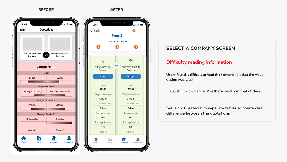
SCREEN REVISION


PROTOTYPE
VISUAL DESIGN
After completing the user testing sessions, it was time to seek inspiration for developing brand identity. I began by exploring and gathering inspiration from Dribble and Pinterest. I wanted the app to have a modern and minimalistic visual appearance. I wanted app users to feel secure, consistent, and dependable.
MOOD BOARD

WORDMARK

BRAND COLOURS


KEY LEARNINGS
WHAT DID I LEARN FROM THIS PROJECT?
-
Empathizing with the user and keeping aside personal biases.
-
More the insights from interviews the better the understanding of the problem.
-
Focus on finding inspiration is very important for UI design.
-
It is vital to determine and prioritize the tasks while designing as a person can get carried away by various features which might be of less importance to the users.